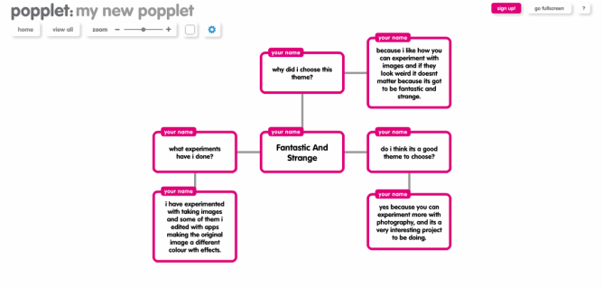
Fantastic and Strange
I chose this theme because i thought it would be very interesting to do and i like how we can take a image and make it look weird but wonderful, i think this would be very good project to do. I think i will base it on people and make them look different by putting objects on their face, or paint on their face or take a picture and collage on top of it. Or i might do objects and make them look weird like Tommy Ingberg because he did a persons body and did a balloon as his head because its a human but having a balloon on his head makes the image look really interesting. I think the artist i am going to base my theme on is Laura Williams because i really like her photography because its really strange and its really interesting. Most of my images that i have been taking images of has been shadows and reflections, at first i wanted to objects and people but I think i will be basing my exam project on reflection as i have experimented with many of these.
Tommy Ingberg
|
He says his found something he loves doing and something he can be proud of, My favourite image of his is properly the one of the tree where the leaves are balloons because i think its very cute and looks interesting. One of my least favourites would be when the man standing under the rock because i think its not interesting and dull and needs a bit more in the picture to make it stand out maybe colour would make it interesting but his style of fantastic and strange is black and white. I like the techniques he uses in his images where he has taken the main part of the image out and replaced it with balloons. I think he has brought a lot of attention to his photography and tried hard to make it come out the way it has.
My favourite image of januz miralles work is the first one because i like the colours that has been used because i think they stand out more better then the other pictures but i do like them, my least favourite is the last one because its very plain and boring and has no colour. But i like the style of his images because they are very different and it looks like a collage but on a person apart from the last one because that looks like a drawn image not real life 3d collage, thats why the other images interest me more. I like the approach of his images because they show the bright colours he uses and his background on the picture is plain so it stands out more. She began exhibiting in fine art in 1990, My favourite image of her photography is the last image because it look very interesting because it looks like she's going to fall but she captured this image in the right time. My least favourite is the middle one because it doesn't have that much colour but it is interesting because it looks like she's floating in the air but she's not. I like how she used the plain background on the last one and put the light on her so her shadow is reflecting but the chair is not on the background so it looks really good, i also like how she used colour in her pictures and not just black and white. I think sam taylor wood is a really good photographer and she knows how to make her images look fantastic and strange in a different way. Laura Williams is 19 and is a photographer and she does really good fantastic and strange, My favourite image is probably the first one because it looks really weird because it looks like she actually see through and its kind of strange. One of my least favourite ones of hers is probably the one when she is standing in a door way outside because it seems plain compared to her other images but i still like it because it is still weird where it is because it looks strange and thats my theme but she is a really good photographer and i would maybe base my fantastic and strange on her pieces. |
My fantastic and strange
|
|
These are a few of my images of my fantastic and strange that i took, i think it was hard at first to think of what to do for fantastic and strange, but after i took my first image it was easy to think of strange things to do. I think fantastic and strange is a good experiment to do in photography because its fun doing these images. I think the picture that went the most successful was the last one because it looks like someone is standing there but you cant see there legs or arms so it looks scary but strange. i think the image that was least successful was the second one because its a bit boring and doesn't really look fantastic and strange. I think in these images i could edit them and make them brighter or make them black and white just so they are all different.. In my fantastic and strange i would like to do things like this, For example clothing and people and edit them and make them look different and strange.
Evaluation of the two images: The most successful out of these because of the background, would be the first image as the background is the same for example its just leaves so it brings more focus on the shoes which is supposed to be the main part of the image, The reasons why the second image is least successful is because the background is not the same, an example of this would be there is a triangle shape on one side with a bench so the background clashes with the main focus of the image so it brings more attention to the background, To make this image better i would have to make sure when i take the image i would have to put these objects in a place where its the same background and maybe blur it so the image look brighter and put more of a colourful effect on it because its quiet dull. These are some more images i have taken, i think my images was more successful this time then last time. My favourite image i have taken was the first one because it looks like her head is a skull and its very different from the other images i have taken because i have not taken any like this so far, Even better if i made the skull stand out and the rest of the body blurry or put a effect on it. My least favourite is the one with a watch in the cup because i think it looks quiet strange and its blurry so you cant really see what it is. This is some more of my fantastic and strange, I think my most successful is the first one because it looks quiet strange, even better if i maybe did close up on these pictures for example a close up on the face because it would look quiet different. I think my least successful is the image with the hand because it looks plain and i looks more normal that fantastic and strange so i think it doesn't really work well in this topic, even better if i could of put a different effect on it so it looked really different. This is another fantastic and strange image i took, I put a effect on this picture with an app i used using an iPod, The reason why i decided to take an image of the sky is because the sky is quite fantastic and strange as it never looks the same and the clouds are always different, so i decided to put an effect on this to make it look even more strange. even better if i experimented with different effects and put them on here to because it could of shown how different an image can look with just a effect. These are more of my fantastic and strange images. The image that i think worked well is the first one, because it looks quiet creepy looking and weird but i like that its blurry because it makes the image looked quiet faded but you can see the main part of the image, Also its black and white so i like how its the same because it has the shadows of light and dark. The image that i think could of been better is the second image because i think the background could of been better where i didn't have the tiled floor because i think it should of been just plain. The image that was least successful was the one with the coat because i think it didn't work out well because its normal and their is nothing fantastic and strange about it. Here is a few more of my experiments i done for fantastic and strange, i think these experiments are very different from the other ones i have done as i have used an effect on everyone, I think the most successful image could be the first one as its shadows of trees on a bench but it looks like a mirror image, i used this effect as i think it made the trees stand out more then the image when it had no effect, even better if the image looked less blurry and more bold and bright. I think the image that was least successful was the second to last one because it doesn't really show fantastic and strange because it looks like a really bad image and its very dull. |
My Mind Map
Fantastic And Strange Artists
|
|
Mari Mahr is one of the artists i have chosen, her images are in black and white, which makes her different from different artists. The image is of a little girl, One half of the picture looks like it was photoshopped with a dolls head as her face, this makes the image look very strange and creepy. The other half of the image looks normal apart from there is a toy car and butterfly photoshopped in the corners, this may show that because she's a kid she likes to play with toys and she may like butterflies. The image as a whole looks old fashioned but represents fantastic and strange really well. Penny Jensz is a photographer her images are very interesting and many people are influenced from her images. She likes to explore with taking images and cutting or taring parts of pictures and sticking them to the original image to get a freaky looking picture, i think her images are very interesting. I like this image because it looks like she has used a weird animal skin for his neck and half the side of his face, also it looks like his face has been changed and moved around. |
My ScreenShots
|
These are some screenshots of what i have been doing for my exam, at first i took an image that i captured and edited it on iPhoto with pencil and drew a face with dots but still kept parts of the body in the image. After that i cropped the image and i then clicked on the edit sign and changed the colour of the picture to many different colours. At the end of this i printed them off, I did this image in 8 different colours but i only used 6 because one one the colours didn't work with the final piece. These are a few of the colours i used in my final piece because i didn't screenshot the other colours. I used graduate colours, bright pink to baby pink and blues and purples. i took away a few of the colours i was going to use, an example is green because it didn't work well with the pinks and purples or blue because it was dark green and was not as bright as the other ones are. I think what could of been better is some of the images could of been clearer. At first i was just going to use black and white or sepia but there wasn't a lot of experimentation to be done with these colours because they are dull, This is when i decided to do bright vibrant colours to make my piece stand out more then it was initially was going to be. I think what worked well in the experiment was i learned how to do more things on photoshop and editing my images, What could of went better would be experimenting with more things to make my images more interesting. |
Final Evaluation
I chose fantastic and strange because I think its a really good theme to do because I experimented with taking strange but interesting images, I also got to experiment with photoshop and editing the images on the picture edit. The ideas I have developed about my chosen theme was at first I was going to do a black and white theme with one image I have chosen to do but after I decided to do a colourful theme with bright neons to make the image stand out and then I edited them by drawing dots on the image and then changing the brightness and contrasts of the pictures, the object I used to take the image was an iPod. I investigated in my theme with taking images of fantastic and strange around the school to see if I could capture some strange images, I then started to notice that I was taking more pictures of shadows in my investigation so I then took more pictures of this theme for shadows. The context I have referred to was artist research, I think the artist that connects to my theme looking at it now is sam taylor wood because she uses shadows a lot in her photography and makes the shadow stand out. The experiments I have carried out in my photography is the iPod, The app i used for this is wood-cam because it has many effects to choose from so you can choose to colour you want you image to be in an example is black&white if that was the theme you wanted to do, The techniques I used was when it was raining I went out and took images of the reflection in the puddles or from the rainy doors that gave a good effect or when it was sunny I used the shadows it showed on the floor, or I used a large canvas what is placed by the window so the light came through to show off the shadow I was showing in my theme. The process I went through was taking all my images and then I looked at the ones I thought what worked best and deleted some that was blurred and you couldn't really see the image, Then I edited them with the app choosing the edit colour I wanted to use and then I chose to blur the image or put an effect on it such as paper to make it look scrunched up. I reviewed and refined my images by looking at what I said I could of done better and worked on that when I did my next experiment such as on one image I took, the background was not the same because there was too much going on so when I went to do my next experiments I worked on that and tried to take images where the background was the same. I have recorded my ideas, observations and insights by putting every experiment I have done on the website to recored my ideas, it has helped me to see what I have to do for next time especially if I have wrote down something in the comments next to the images to help me for next time. I have chosen to present my final presentation on mount-board in a certain way where it makes the colours look faded. In this unit I am happy with the fact that I have made progress since we first started because at first it was hard to look for what my chosen theme was but then I started learning what I really needed to look at which was the effects of the image and the background of where it was set.
